MTN Refreshes Its Branding To Reflect the Company’s Growth
Branding is so much more than just a logo.
It’s the look, feel and language used on the website. It’s how you’re greeted when you call the corporate office. It’s the signage that identifies the company’s location and the ambiance when you walk through the front door. A company’s brand is also much deeper than surface level. It’s reflected in how they treat the people who work there. Those interactions then shape the way your employees treat clients — and becomes how your brand is perceived by the world.
After more than 36 years in the marketing industry, MTN, Inc., felt it was time to evolve our brand to reflect who we are, the capabilities we offer and the clients we serve today. Over the last few years, we’ve been hard at work redefining our brand and we couldn’t be more excited to share the outcome of that labor with you.
Here are some of the highlights of the MTN branding refresh.
Brand Positioning
In 1986, MTN started out as a small network of freelancers. We became known — and still are known — for creating compelling visual experiences. Today, our service lines have expanded to include market research, brand management, creative marketing, media strategy, digital marketing, and video. Naturally, our team has expanded, too. Our network of talent includes graphic designers, developers, copywriters, digital strategists, project managers, and creative directors, to name a few. Together, we took a big step back to define who we are, who we want to work with and how we want to position ourselves (market research) to connect those dots.
From that foundation, we developed these mission and vision statements:
- Mission: Conceptualize and execute creative marketing solutions that surpass expectations and reinforce the trusted foundation our partnerships are built on.
- Vision: To be the trusted creative partner for an ever-growing list of innovative and forward-thinking clients.
We also defined our core values, which include: creativity, stewardship, accountability, agility, confidence, and authenticity.
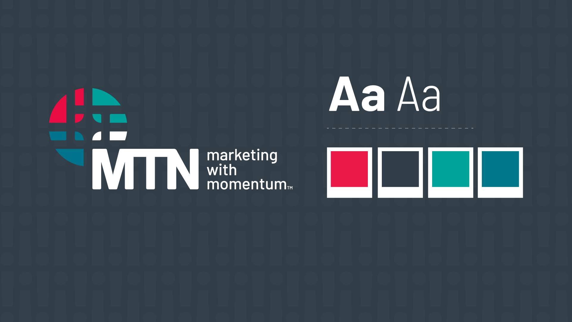
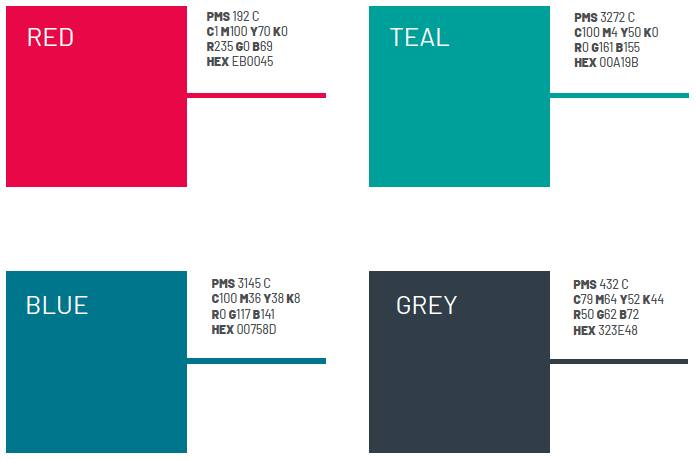
Color Palettes
Color combinations are used to quickly identify a brand amongst a sea of competitors. They also evoke an emotional response from people, which can actually influence their purchasing decision. Case in point, the red used in Coca-Cola’s iconic logo and label is associated with excitement and energy. Interestingly, red is also linked to impulse purchasing, which makes it the perfect color choice for a beverage that’s often strategically placed in a cooler by the checkout counter.
For our palate, MTN chose the following colors based on the psychology behind them and their alignment with our core values.
- Red: Confidence and agility
- Teal: Creative and accountable
- Blue: Dependable and stewardship
- Grey: Balanced and authentic
Tagline
Effective taglines encapsulate who a company is and their unique value proposition in the marketplace.
It should be:
-
- Focused on a benefit. What do clients gain from choosing you?
- Simple. Get your message across quickly.
- Catchy. Make it memorable.
- Unique. Differentiate yourself from competitors.
- Meaningful. Capture your brand’s essence.
We went through dozens of potential iterations of our tagline, based on themes aligned with our values, before arriving at the final one:
Marketing with momentum.
Icon
MTN is made up of a network of talented people from various disciplines who work together to achieve a common goal. In our rebranded logo, we wanted to create an icon that embodied collaboration. Starting off with hand-sketched drawings, we played with different shapes. Finally, we landed on a nexus, which is a connection or series of connections that link together. A nod to our previous branding, we also incorporated an exclamation point and had all of the other lines feed into it to form a single shape. It represents the fact that MTN is bigger than our office building. We are solution finders who bring together the most talented group of people to get the job done.
When rebranding, we asked ourselves these questions:
- Is it memorable? The design needed to be visually intriguing, unique, engaging, and distinguishable from competitors.
- Is it versatile? We ensured the brand would translate across multiple mediums, sizes and applications.
- Is it timeless? Through color, shape and typography, we created a design that looked current, but not trendy (which would give it a set expiration date).
- Is it authentic? The rebranded logo embodies our company philosophy and mission positioning.
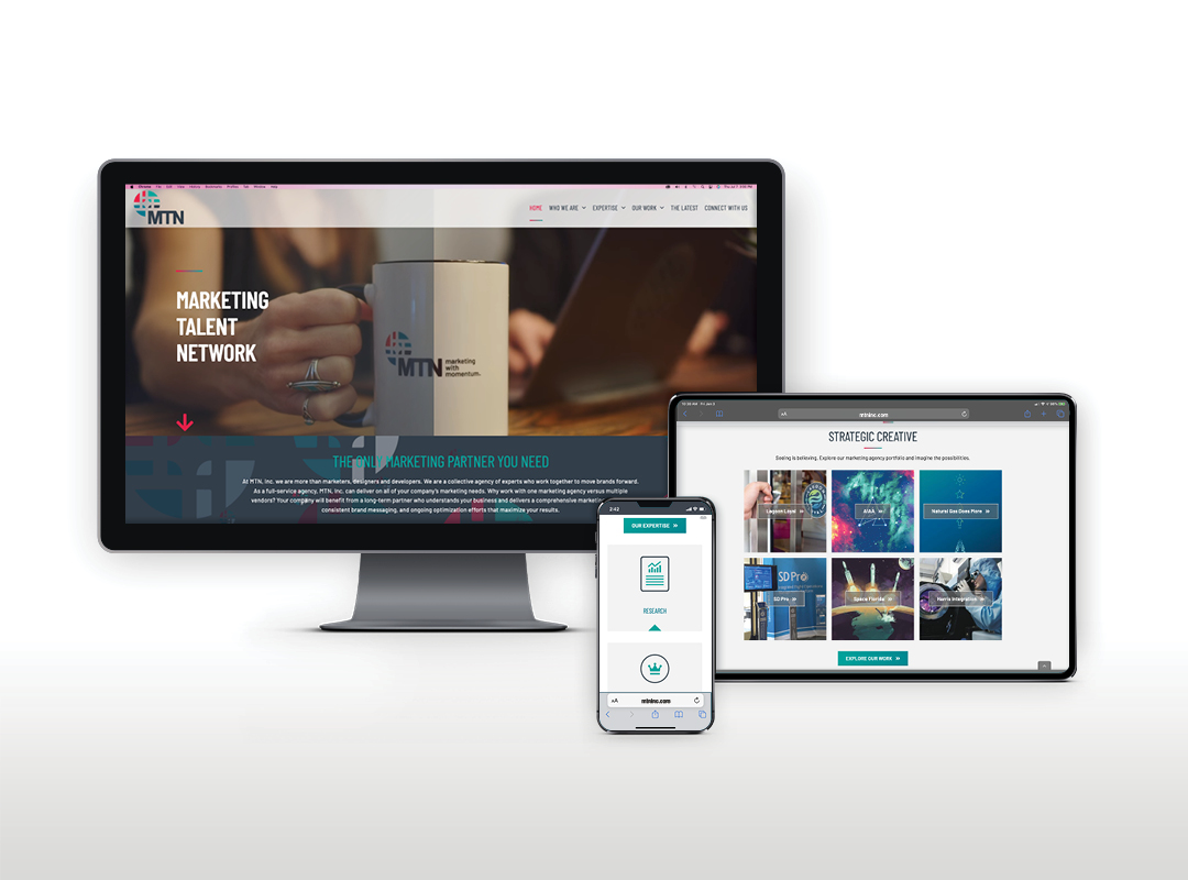
Website
Like an online storefront, your website should embody who you are as a brand. Our previous website needed a redesign to align with our brand identity, voice and tone, and design and development capabilities. From the ground up, we rebuilt the site, determining which pages to include, keywords to target (SEO), and messages to convey. To identify the key elements that should appear on each page, we began with wireframes. Then we incorporated the color palate and built the pages out. Finally, we tested for cross-browser compatibility and user experience across devices.
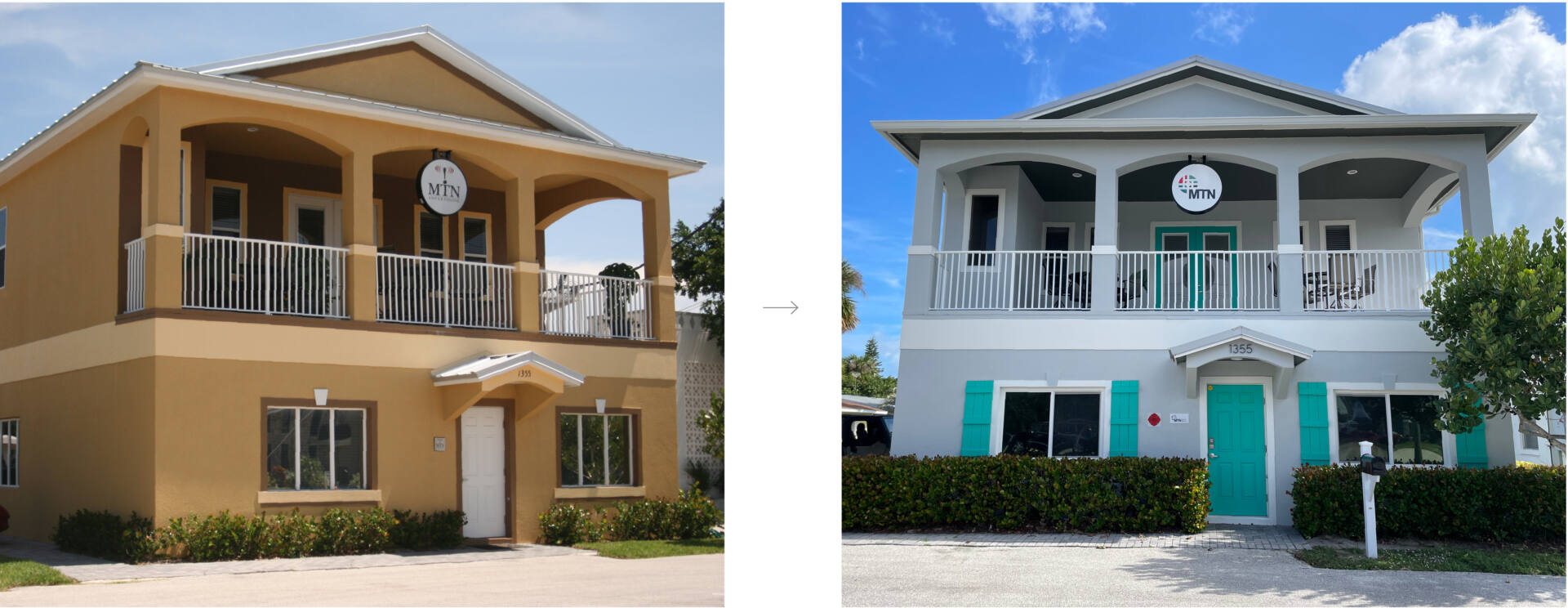
Office Renovations
As we updated our brand online, we knew our physical space would need to evolve along with it. To make our brick and mortar location more visible, we invested in a sign that illuminates at night. We also repainted the office building from a Anjou Pear/Toasted Brown to Grey Sanctuary/Tantalizing Teal for a more vibrant, professional and coastal chic look. On the inside, we also created a more open work space to encourage collaboration amongst team members. Standing desks are also available, which promotes muscle activity and better circulation.
From our mission and logo to our website and office building, we’re excited to have a brand that represents who we are and how we can elevate brands like yours.