EcoSolutions Asia Identity
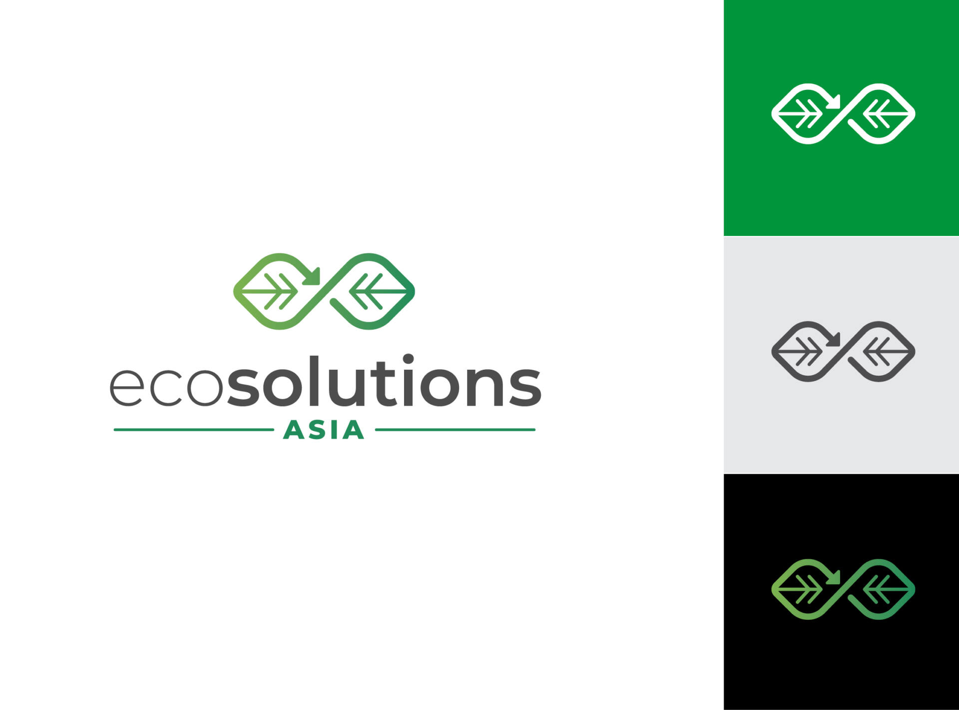
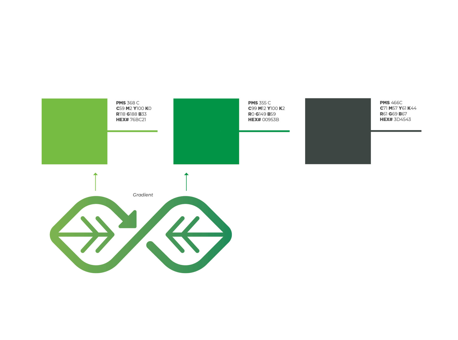
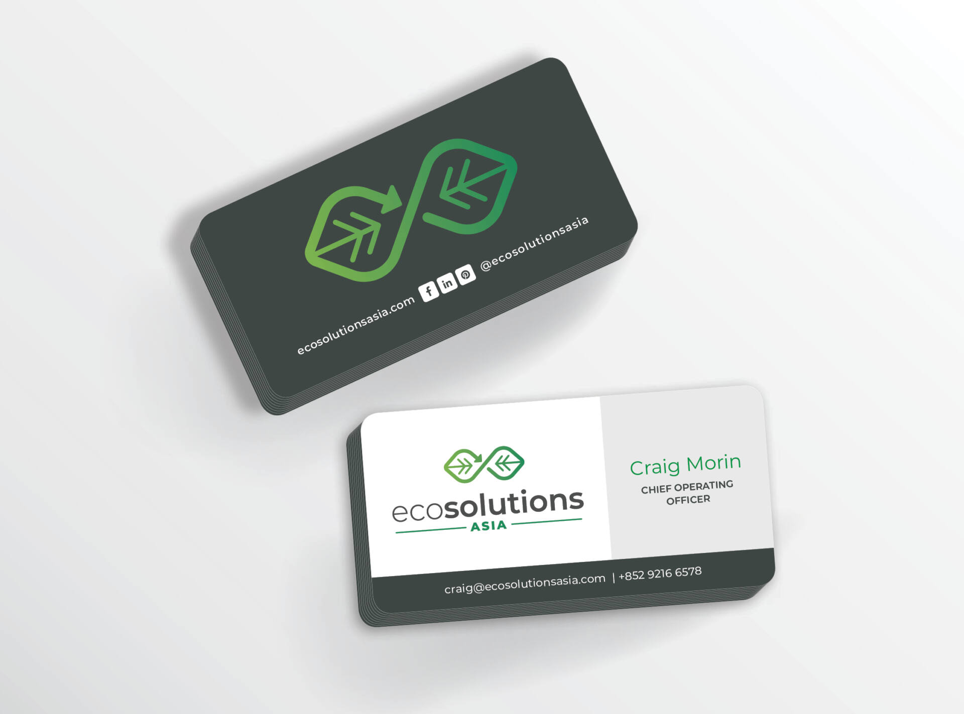
The EcoSolutions Asia logo uses a unique icon identifier representing a circular economy of re-use and minimization as it relates to global sustainability. The perpetual motion within an infinity shape also signifies the company’s way of forward thinking and innovative problem solving. The color palette factors a consistent translation across global cultures. With company philosophy in mind, green equate to environment, sustainability and progress, while gray suggests intelligence, wisdom and reliability. The logo uses the Montserrat typeface for its legible sans serif characters, equidistant kerning, large family of type styles, and array of glyphs for translation purposes.

- All
- All
- Campaigns
- Integrated Campaigns
- Logos & Branding
- Outdoor
- Publications
- Sales Collateral
- Tradeshows & Events
- Video
- Websites
Space4All Brand
Logos & BrandingAscend Conference
VideoProdigy Autism Center
Logos & BrandingL3Harris ADG
VideoChesapeake Utilities 2022 Sustainability Report
PublicationsAviation Forum Finale
VideoChesapeake Utilities Corporation
WebsitesNatural Gas Does More
VideoAIAA SciTech Promo Video
VideoNatural Gas Does More Campaign
CampaignsHistoric Downtown Melbourne
Logos & BrandingInternational Space Station R&D Conference
Logos & BrandingCommunity Foundation for Brevard
WebsitesDowntown Melbourne Food & Wine Festival
Logos & BrandingFlorida Gas Utility Sales Collateral
Sales CollateralProdigy Autism Center
WebsitesCASIS
PublicationsAsk4Gas “Hurricane Party”
VideoCuizine Restaurant Website
WebsitesMoon Golf “Perfect Customs”
VideoSD Pro Sales Kit
Sales CollateralSpace Station Explorers
Logos & BrandingFlorida City Gas Gratitude Video
VideoHarris Corporation Acquisition
CampaignsISSRDC Intro
VideoRG Next Website
WebsitesCASIS
PublicationsMy Family ENT Website
WebsitesTECO
VideoChesapeake Utilities 2021 Sustainability Report
PublicationsNatural Gas Love
VideoFlorida Natural Gas Association Brand
Logos & BrandingISS National Lab Brand
Logos & BrandingMarlin Compression Website
WebsitesDowntown Melbourne
WebsitesSpace Station Explorers Passport
Sales CollateralSpace Life Sciences Lab
Logos & BrandingLagoon Loyal
VideoDowntown Melbourne Food & Wine Festival
WebsitesCommunity Foundation for Brevard
Logos & BrandingSD Pro Campaign
CampaignsEcoSolutions Asia
Logos & BrandingLagoon Loyal Website
WebsitesRedwire Space Annual Report
PublicationsLagoon Loyal Identity
Logos & BrandingLagoon Loyal
CampaignsIndieGalactic Space Jam Campaign
CampaignsNatural Gas Does More Website
WebsitesSpace Florida Annual Report
PublicationsMelbourne Beach Living Shoreline Kiosk
OutdoorFlorida Natural Gas Association Website
WebsitesChesapeake Growth Holiday Card
Sales CollateralFNGA “Natural Gas: Limitless Opportunity” Brand
Logos & BrandingRedwire Space Facility Branding
Logos & BrandingOur Marketing Services
We’re the only marketing partner you need to get the job done.
Research

Brand Management

Creative

Media Strategy

Digital Marketing

Video & Animation

Work With Us
Ready to take your marketing to the next level? Give us a call at 321.779.1010 or fill out the form below.
"*" indicates required fields


